For nation states, but also regions, cities, unions or sports clubs flags are an important source of identity. They are full of symbolism that aims not just to portrait and reflect, but also to create the values of the people they are supposed to represent. There usually are no coincidences when it comes to flags, and every little detail is carefully thought of.
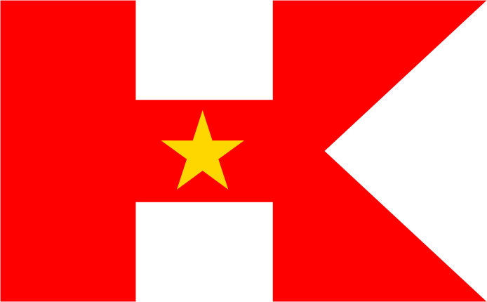
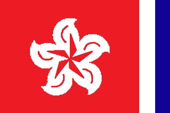
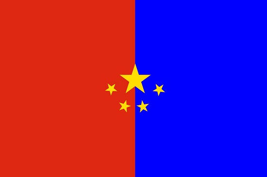
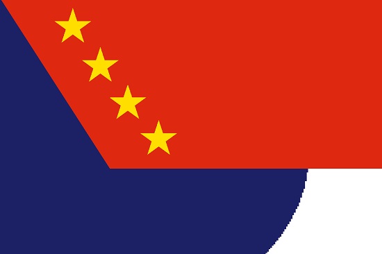
In 1987 a contest was held to find a new flag for Hong Kong. Of the 7,147 submissions six finalists where selected and presented to the National People’s Congress, which rejected all of them and commissioned architect and one of the panel judges of the contest, Tao Ho, to create a new flag. It was adopted in 1990 by the NPC.
(proposals via Wikipedia)
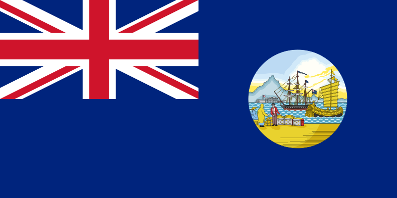
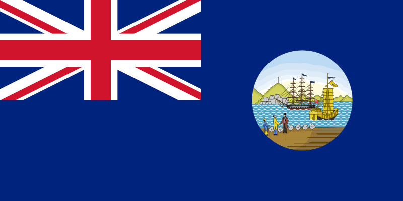
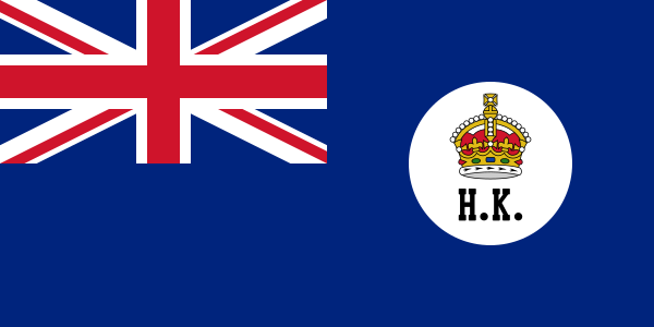
Prior to 1997 several different flags have been flown in Hong Kong as symbols for the city and its people. While imperial China did make use of banners and colors, the idea of a flag is closely tied to that of a nation state, which emerged together around the world in the 18th and 19th century. Given that the yellow dragon flag of the Qing dynasty was only introduced in 1862/1889, the first flag that was flown over Hong Kong was quite possibly the Union Jack in 1843. In 1870 Hong Kong had its first specific flag, which was updated in 1876, 1910 and again in 1959.
While the flag of 1870 appears generic and boring, it was quickly changed. The flag of 1876 already greatly reflects what we can assume is the identity of a port city. Three merchants, one with a distinct conical hat are seen engaging in trade in an idyllic setting in front of green mountains. Two ships, one showing western, the other eastern construction styles are anchoring in the harbor. The flag of 1910 shows essentially the same setting, but in a different design.
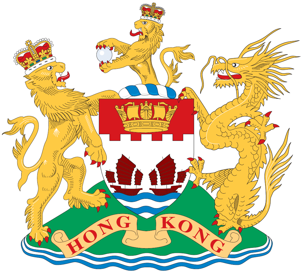
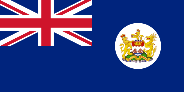
The colonial badge which had existed since 1843 was adopted as the coat of arms in 1959 as the colony’s flag and greatly complicates the symbolism of Hong Kong’s banner. The western ship is gone, instead there are two junks facing each other under a naval crown. This inner shield was also known as the ‘Lesser Coat of Arms.’
The lion cub above the shield is of royal blood and carries the pearl of the orient, representing Hong Kong herself. She is facing an older lion, representing Great Britain, while turning her back to a Chinese dragon, which is nonetheless prominently featured. Having only four claws the dragon is of lesser rank than the dragon of the emperor of China. In the empire, dragons with four claws would be reserved for nobility and high-ranking officials. Dragons in the republican times would generally also only have four claws. It’s also striking that the dragon isn’t chasing the pearl of wisdom. Another interpretation is that the pearl of the orient is the pearl of wisdom, and the lion cub stole it from the dragon and is presenting it to the lion, like a gift.
The symbolism is still present across Hong Kong. The Hong Kong University Student Union still uses a similar version as their emblem for example, while the flag with and without the Union Jack are flown by some members of the Hong Kong Autonomous Movement in protests.
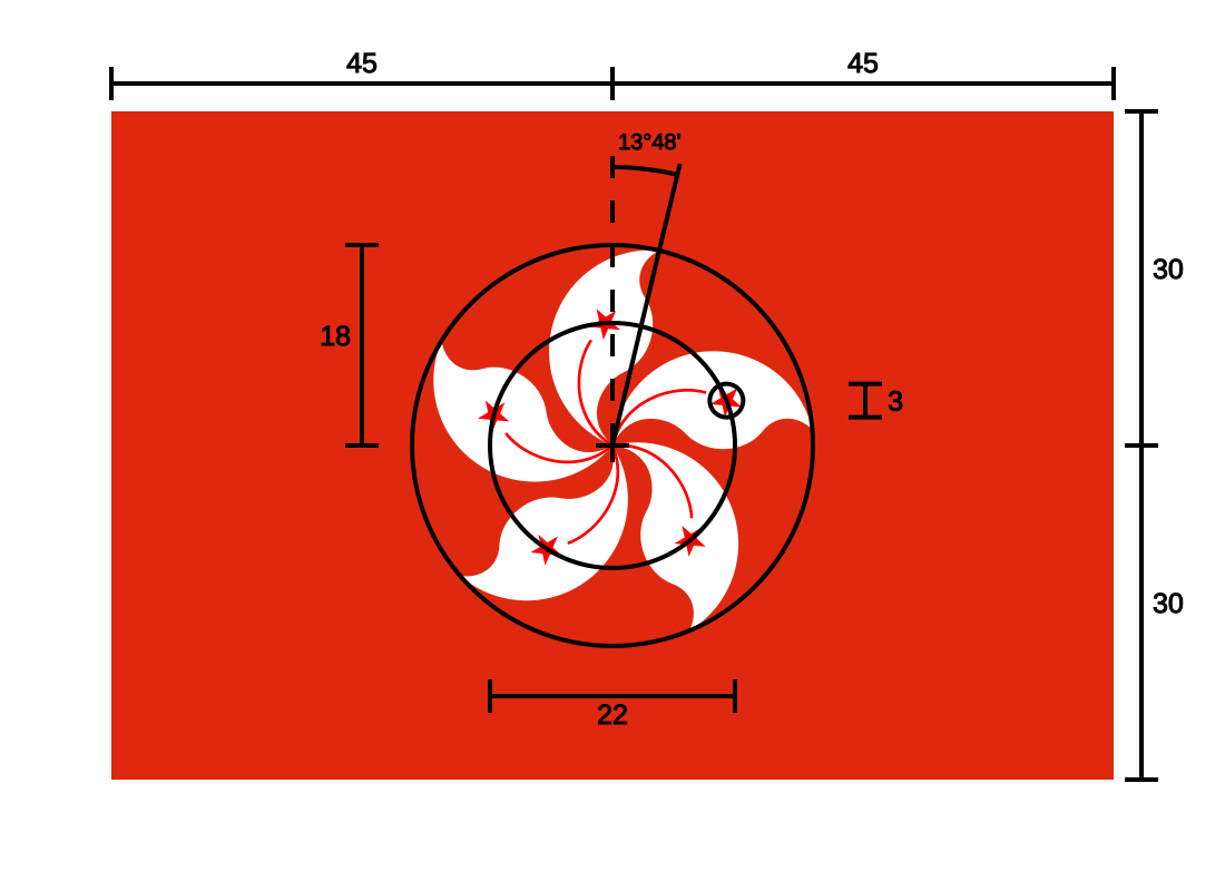
The flag of the Hong Kong Special Administrative Region of China was adopted in 1990 and flown officially for the first time on 1 July 1997. A few months later, though likely unrelated China made it illegal for its regions or municipalities to fly their own flags, although Suzhou, Shangrao and Kaifeng still officially have their own flags.
The red in the Hong Kong flag represents China, and has to be of the same shade as the red in both the flag of the People’s Republic and the Communist Party, as the two are inseparable and one, unified by the revolution, which would be represented by a simple red flag. The bauhinia represents harmony, but also equality, as no part of it are larger than others, and nothing occupies the center. The white stands for two separate systems and is a color not found in the flag of the PRC. It’s also often not considered a color. The red stars are the same stars as in the flag of the People’s Republic, where they represent the four social classes rallying around the Communist Party in the center. Just like in the PRC flag they were originally supposed to be yellow, though such proposals were dropped. It’s also striking that the five stars are all of the same size, and that none of the stars gets to hold the center position. Instead, they all point to the center with their thin comet-like tails (make a wish!).
The stars are politically the heaviest symbol in the Hong Kong flag. You often see organisations replacing them or removing them altogether, like the Hong Kong Legal Information Institute.
It’s also frequently pointed out that the bauhinia itself looks like a weapon with its sharp edges and rotating form, particularly the Japanese shuriken.
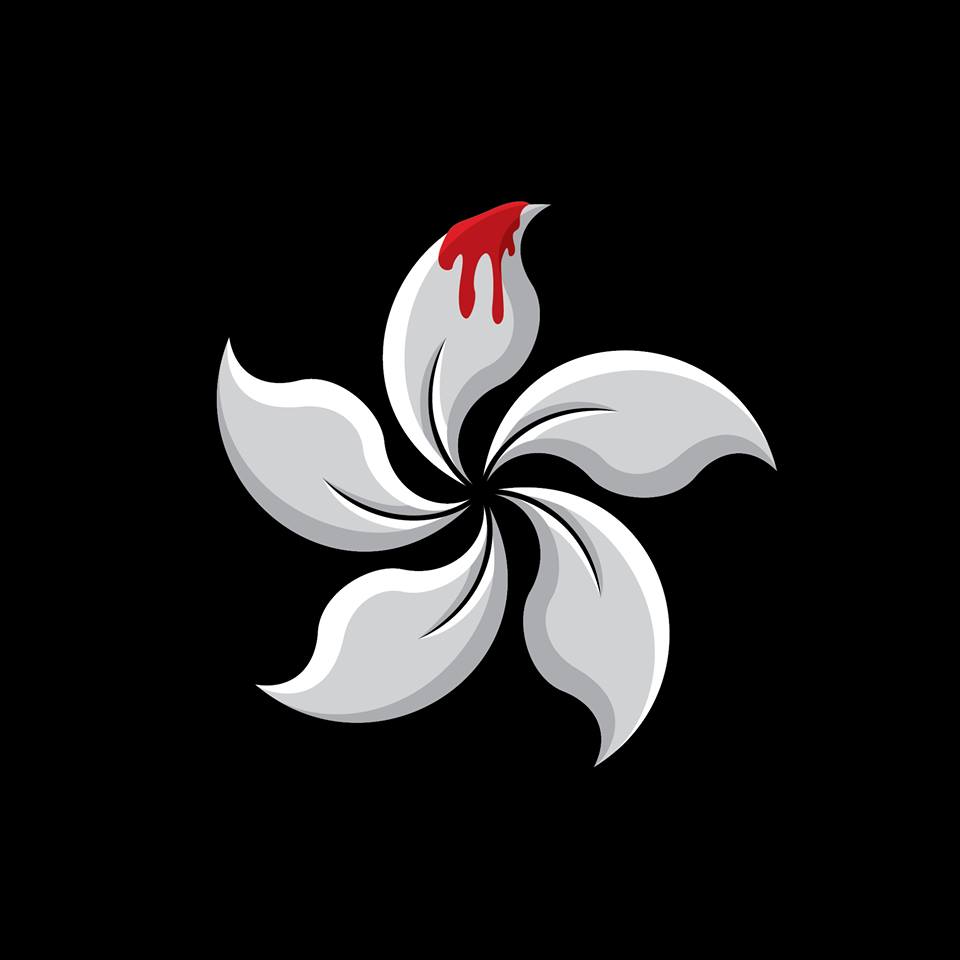
By artist Fat Ghost
The bauhinia is an incredibly peculiar choice for the Hong Kong flag. It’s scientific name is Bauhinia × blakeana, with the symbol × indicating that it is a hybrid. It’s commonly referred to as the Hong Kong Orchid or 香港蘭. It’s official name in Chinese is 洋紫荊, which means something like ‘overseas/foreign purple thorns.’ Because of the uncomfortable resonance of the word 洋 with Chinese officials it is referred to as 紫荊 in government correspondence, although this term would technically refer to a different species.
It is sterile and cannot reproduce, so has to be cultivated by cutting stems by hand. Very likely all flowers growing today originate from the same plant discovered by a French missionary near Pok Fu Lam in 1880.
That is quite heavy and confusing symbolism, and it is not difficult to imagine how Hong Kongers reject it as an icon of identity and are alienated by its properties.
Modern pop culture, large political events and online media allow for a fascinating scale of experimentation for a new source of identity.
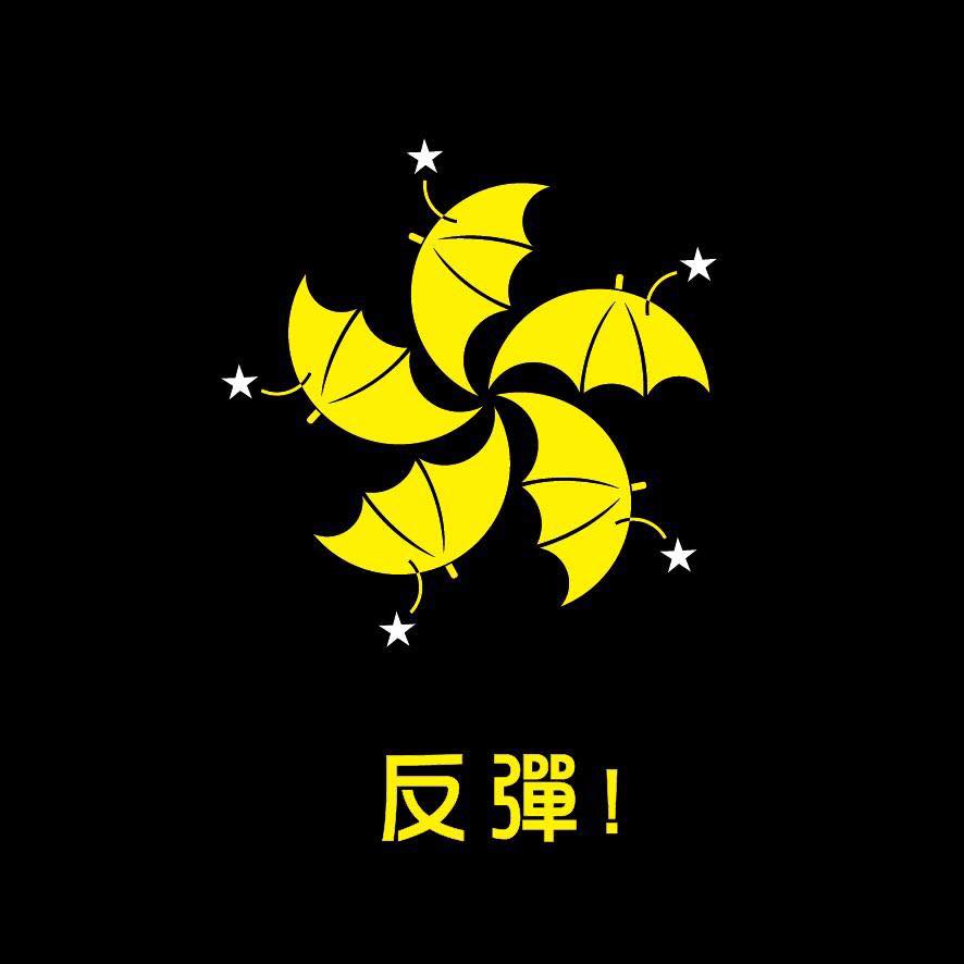
Umbrella Bauhinia by Sadie Lau
This design (Sadie Lau) appeared during the first days of the great protests of September and October 2014. The red has changed into black, the bauhinia is replaced with yellow umbrellas, which collectively reject the white stars, which may still with their white color represent the Communist Party and One-Country-Two-Systems.
The flag below is an alternative design has recently made its appearance at protests, carried by localist groups. The lion and dragon are still there to represent Hong Kong’s British and Chinese heritage. But Hong Kong is no longer a cub clearly turning to either side, but a fully grown phoenix presiding over its heritage.
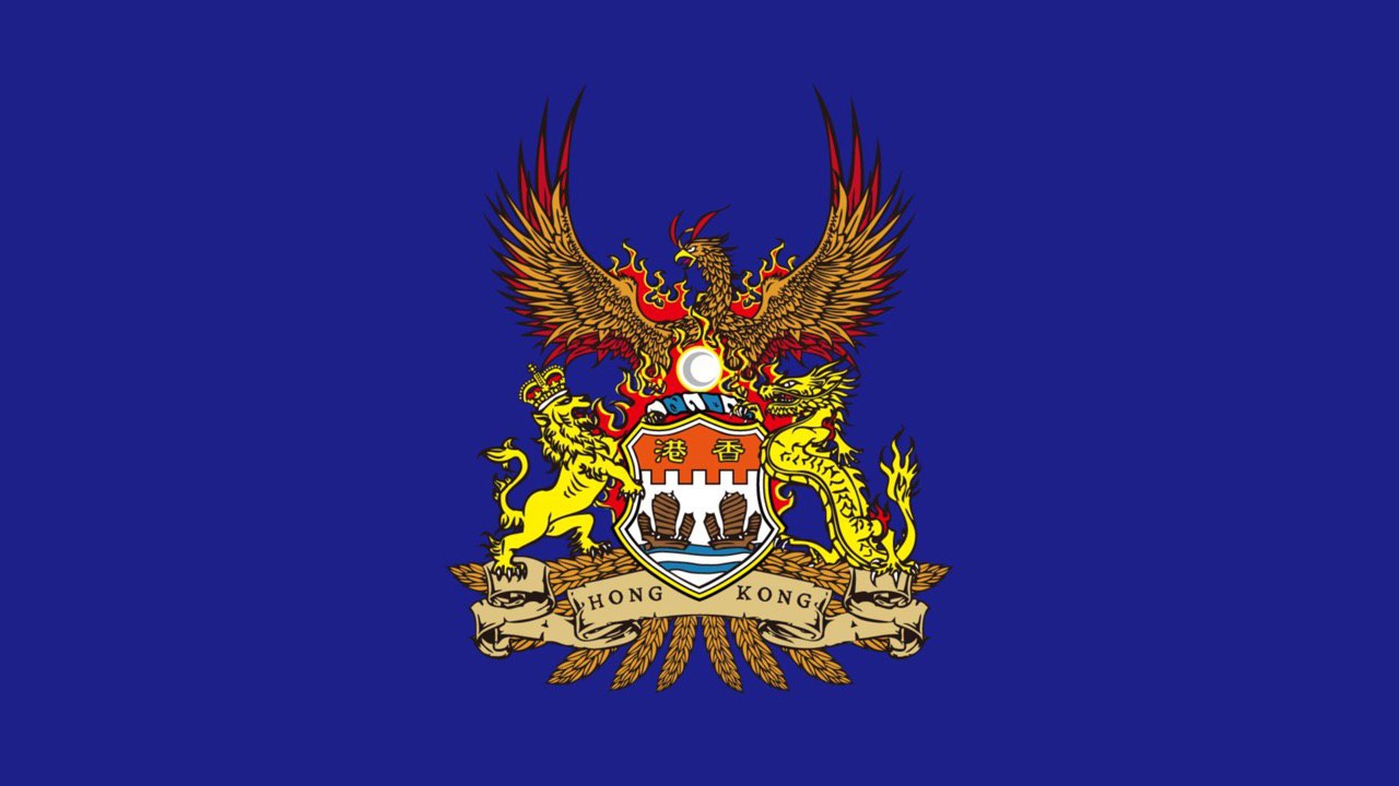
The Phoenix Dragon Lion flag flown at rallies by supporters of academic Wan Chin in 2015.
The 2019 protests against the proposed amendment to the Extradition Bill morphed into the largest mass movement Hong Kong had ever seen. As the protests were met with excessive police force and a lack of government response the movement increasingly became about identity.
The “black” or “blood” bauhinia flag was seen frequently seen at the protests but is more of a protest banner than a national flag. It achieved global recognition when it was flown outside LegCo on 1 July 2019, the symbolic handover day, in place of the red bauhinia flag, without an accompanying PRC flag. It is a variation of the blood bauhinia flag by Fat Ghost.
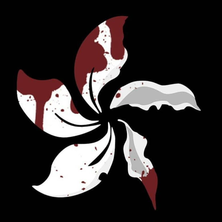
Artist unknown. Please let me know if you find the original artist.
Another iconic design also subtly references the progression since the Umbrella Movement. Instead of Umbrellas, it forms the bauhinia with yellow hardhats, referencing the ‘full gear’ of frontline protesters who regularly find themselves head to head with police.
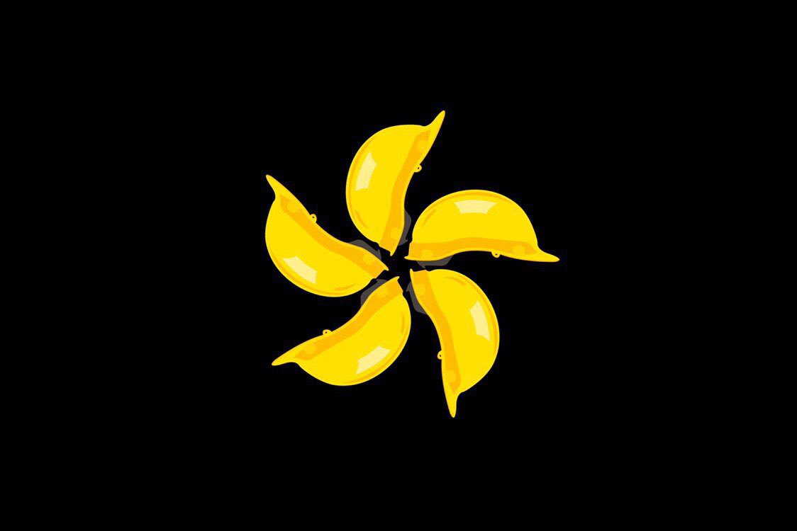
Artist unknown. Please let me know if you find the original artist.





Hello niice post